Introduction to Power BI Tips And Tricks
If you’re looking for a powerful business analytics tool that can help you gain insights from your data, look no further than Microsoft’s Power BI. With its ability to handle large amounts of data from various sources, create interactive reports and dashboards, and provide a wide range of visualization and analysis options, Power BI can help businesses of all sizes make better decisions and drive growth.
Connecting to Data Sources and Transforming Data
- One of the key advantages of Power BI is its ability to connect to data from a variety of sources, including Excel spreadsheets, SQL Server databases, and cloud-based sources such as Azure and Google Analytics.
- By combining data from multiple sources, you can create a comprehensive picture of your business operations.
- Additionally, Power BI provides a range of tools to help you clean and transform your data into a usable format
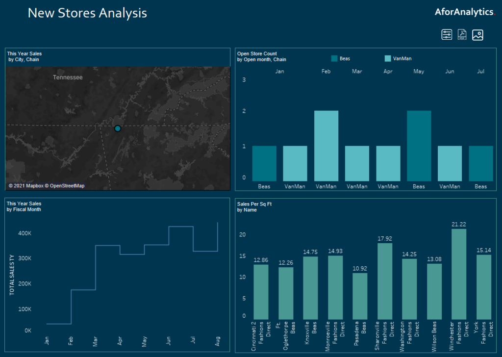
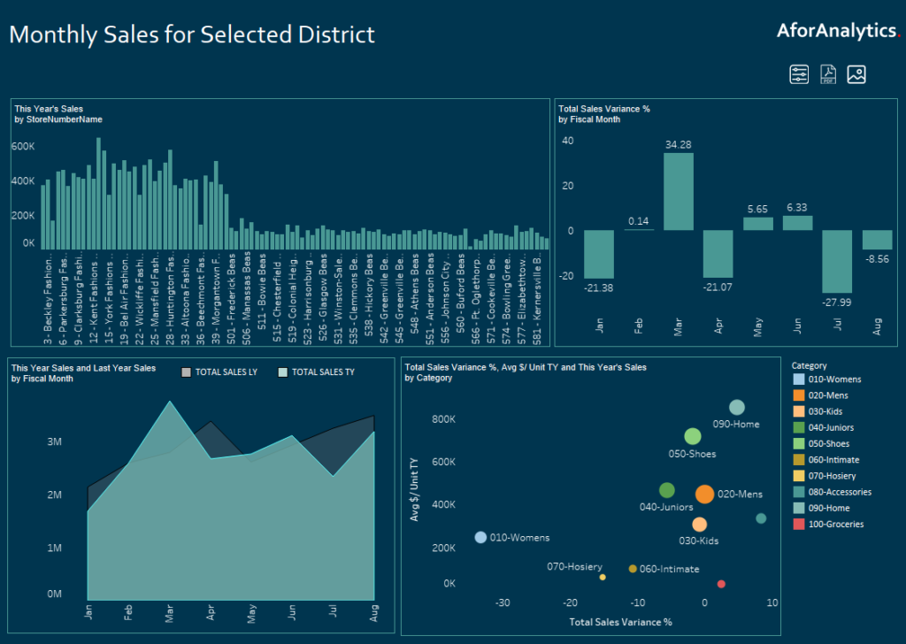
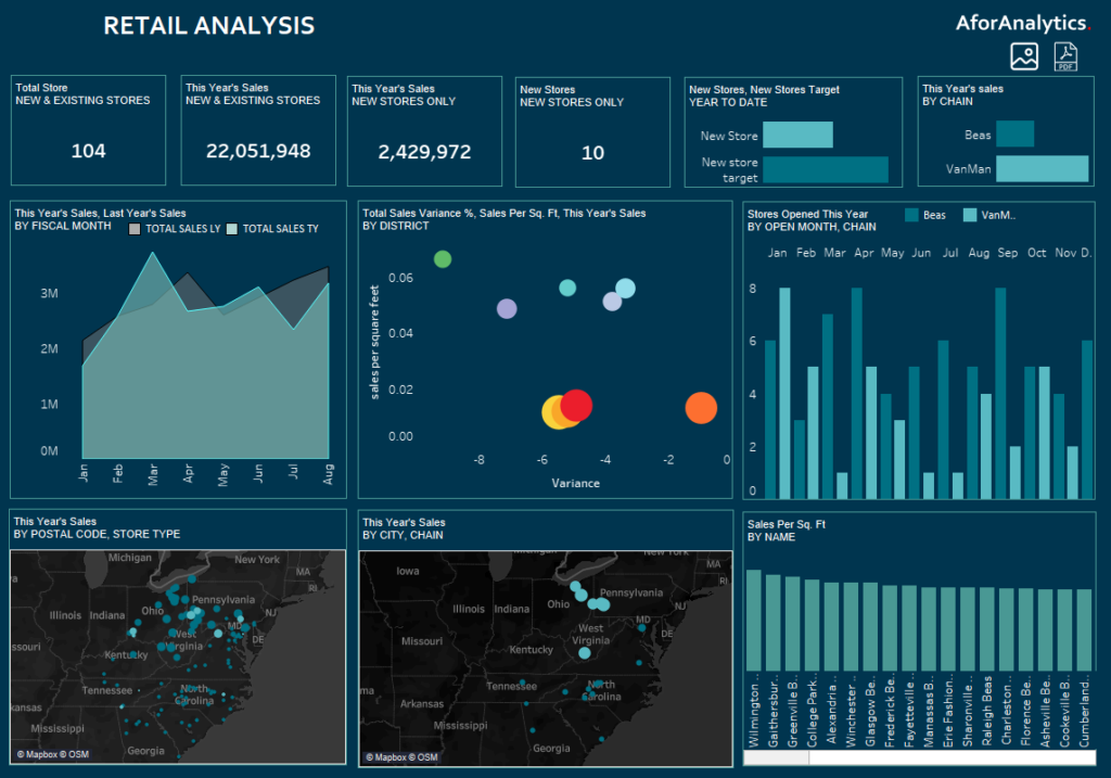
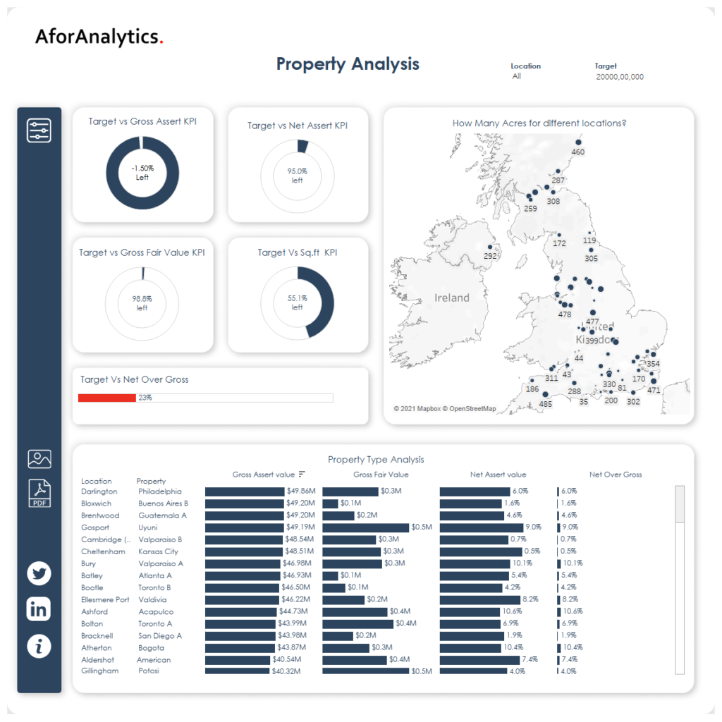
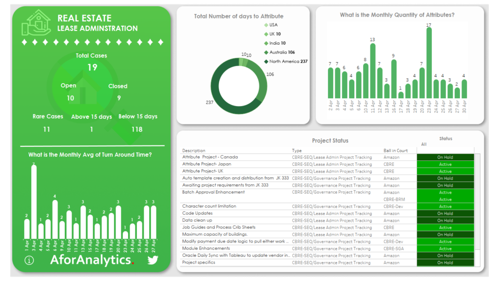
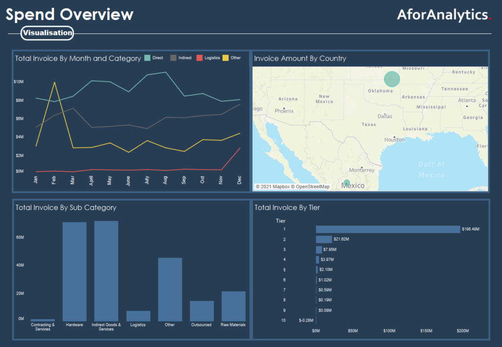
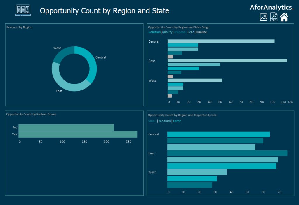
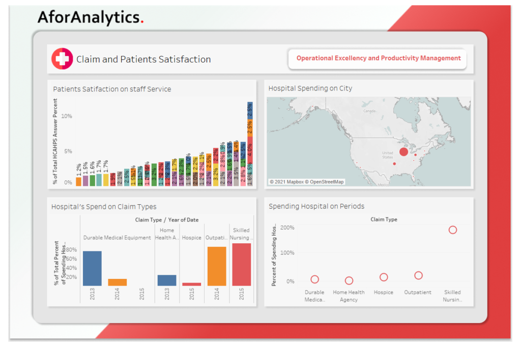
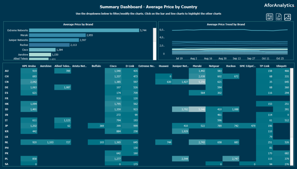
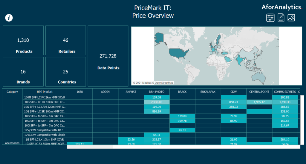
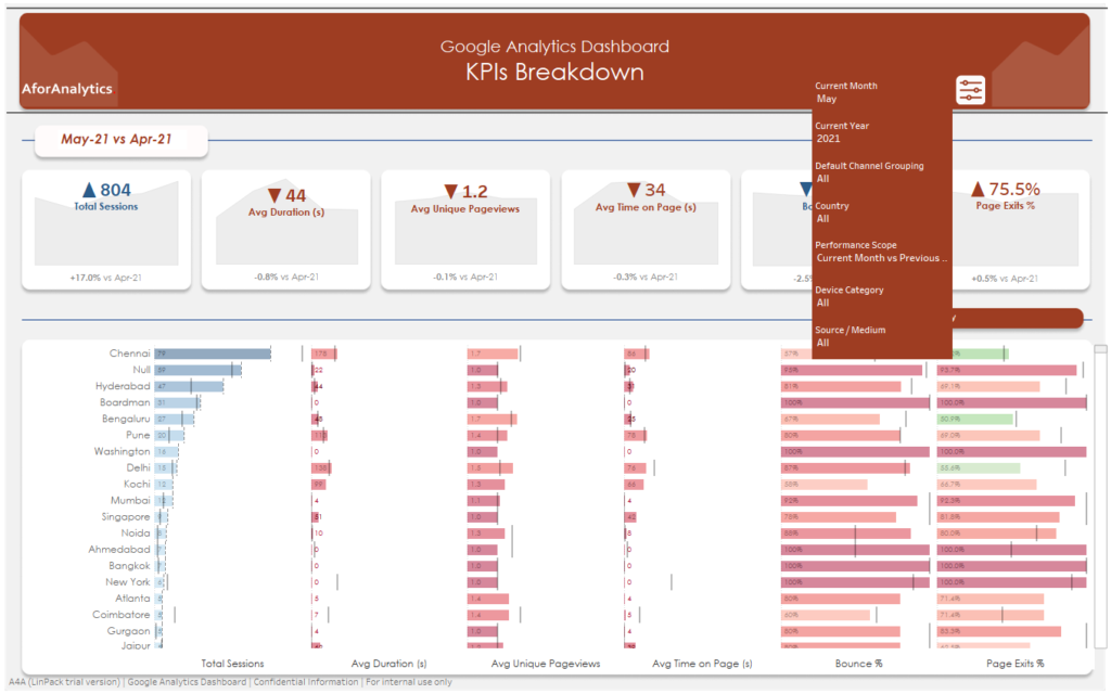
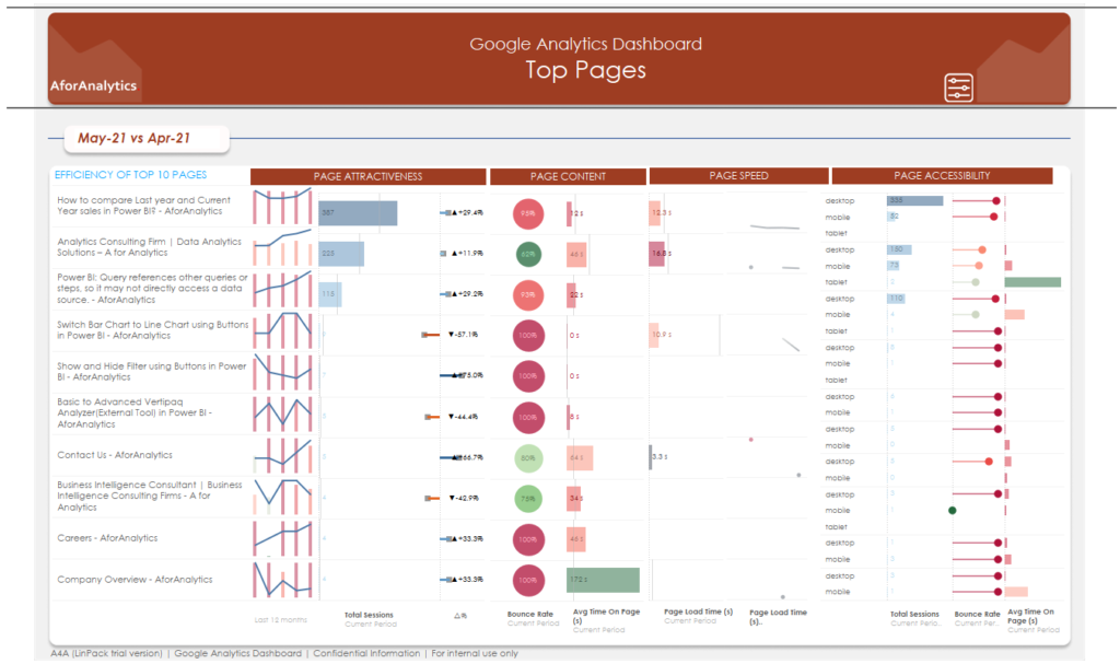
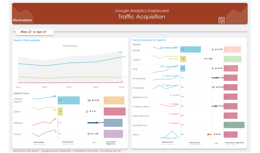
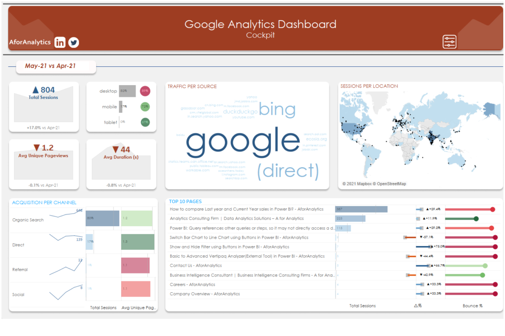
Using Essential Data Visualization Tools in Power BI
- To make the most of your data, it’s important to choose the right visualization tools.
- Power BI offers a wide range of visualization options, including bar charts, line graphs, scatter plots, and heat maps.
- By selecting the right chart type and customizing its appearance, you can create clear and impactful visualizations that help you tell a story with your data.
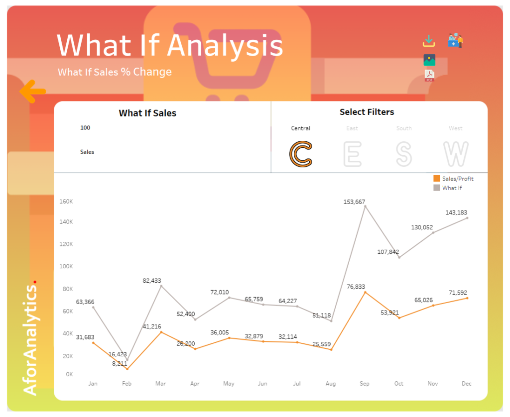
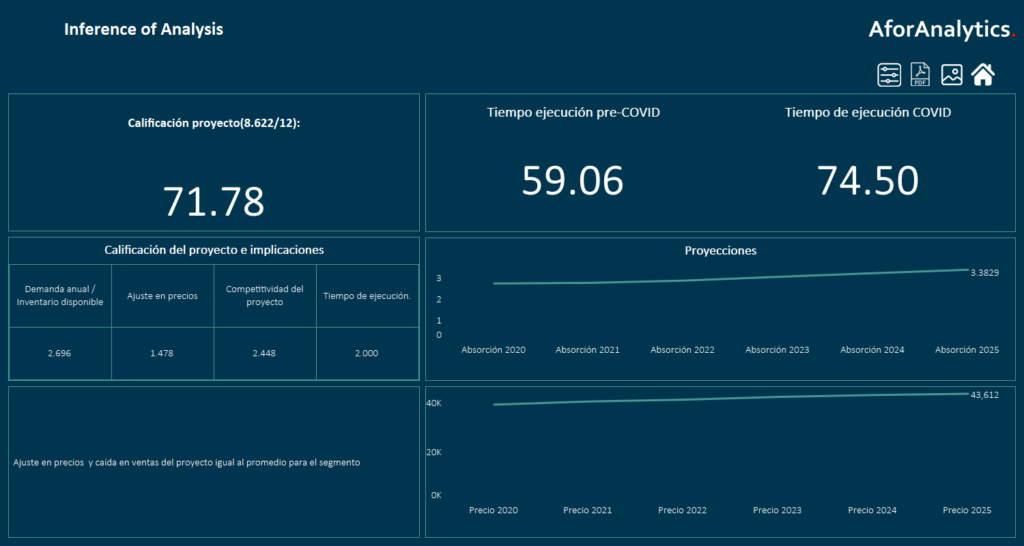
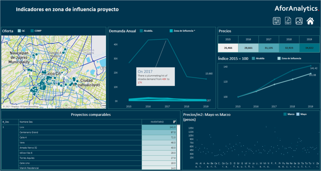
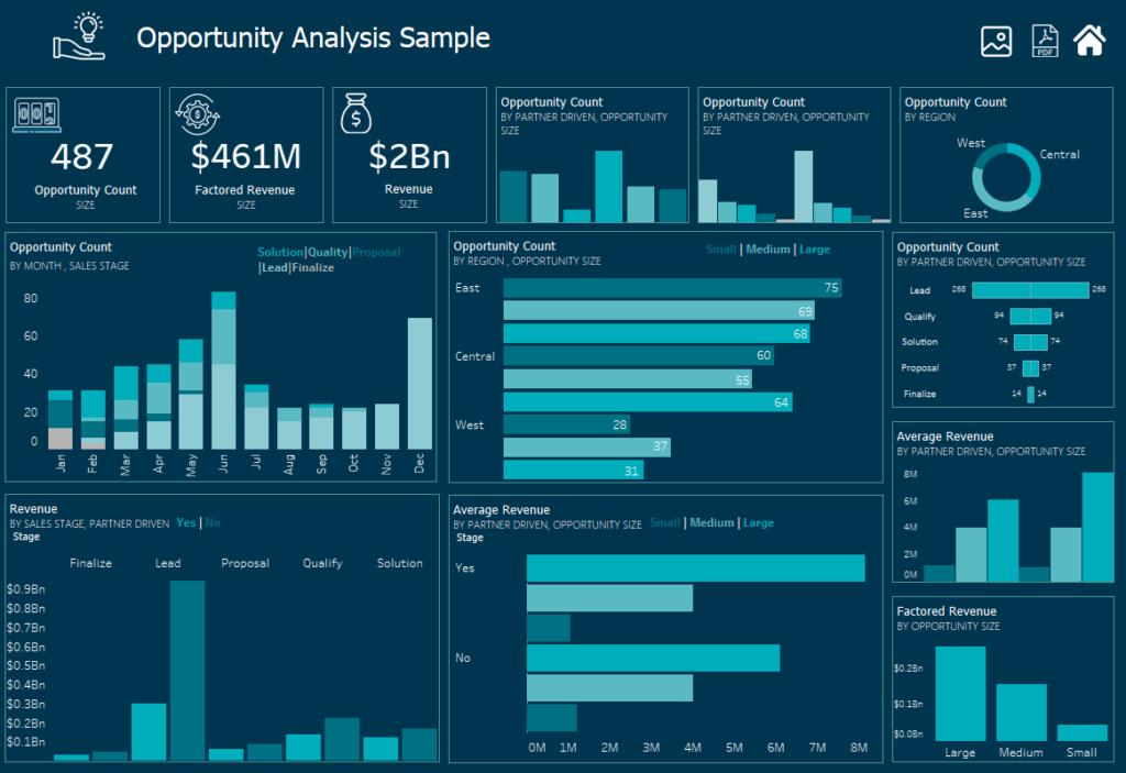
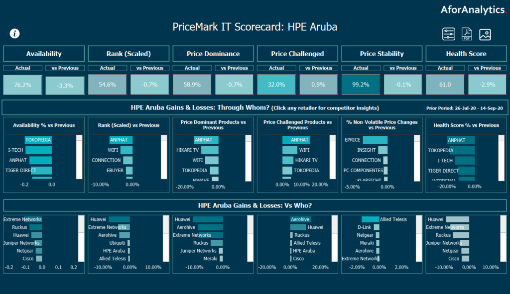
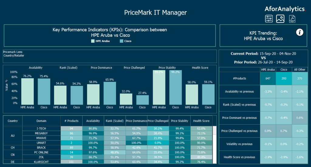
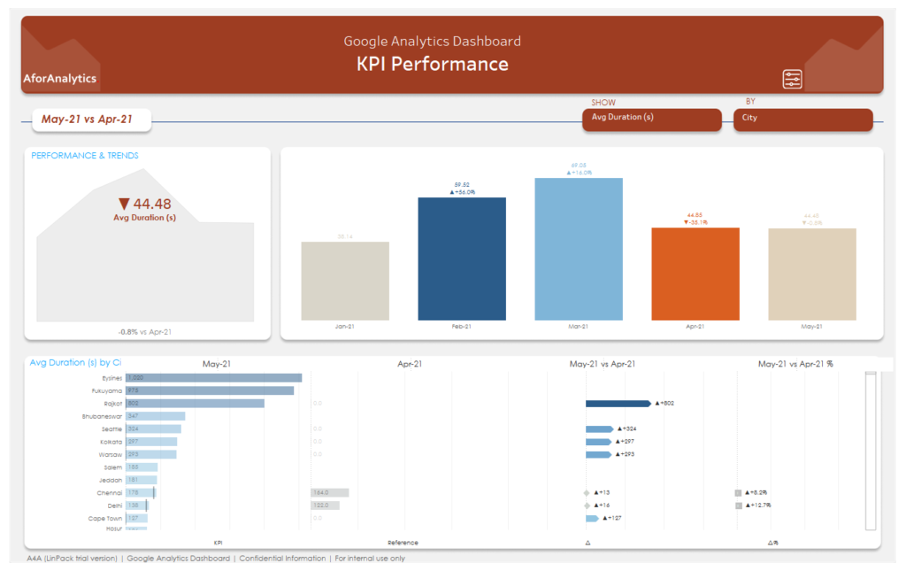
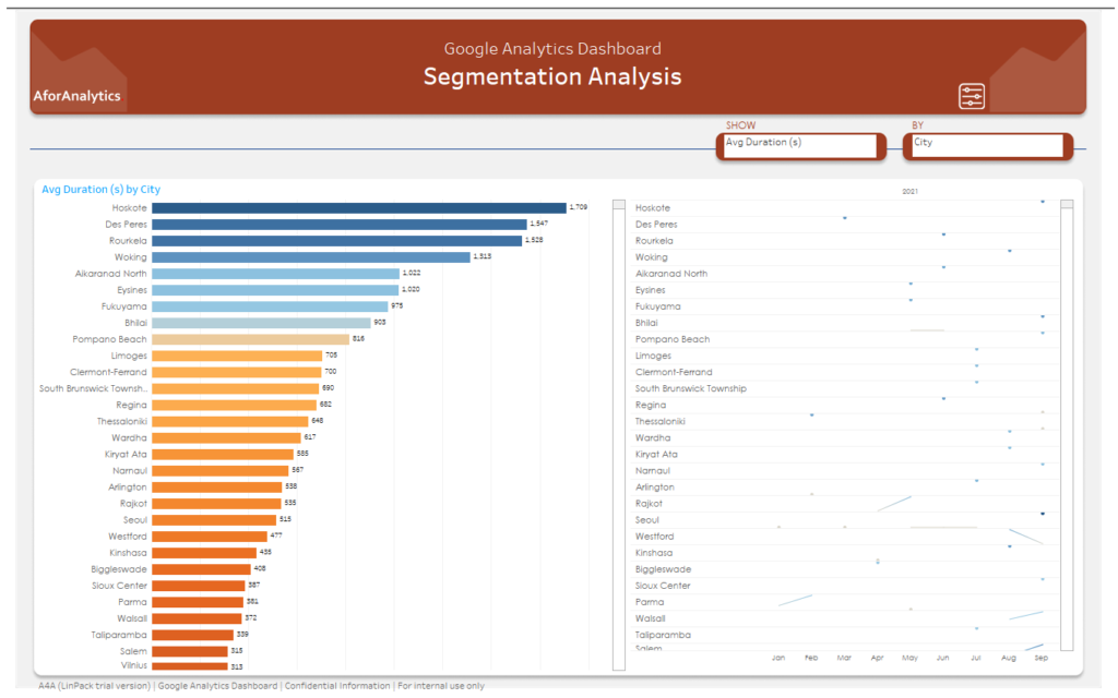
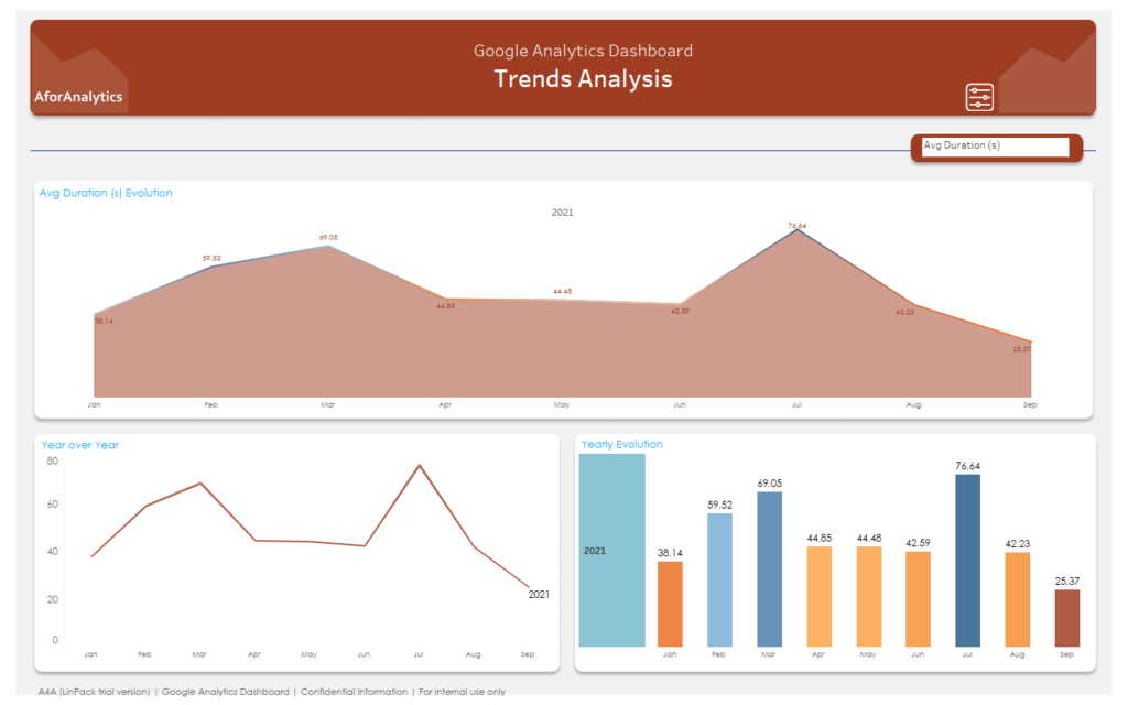
Applying Advanced Data Analysis Techniques with Power BI
- Power BI provides several powerful features to help you gain insights from your data.
- One of the most useful features is the ability to create calculated fields, which allow you to perform complex calculations and create custom metrics based on your data.
- Additionally, you can use Power BI to create filters and slicers to analyze your data in different ways and drill down into specific areas of interest.
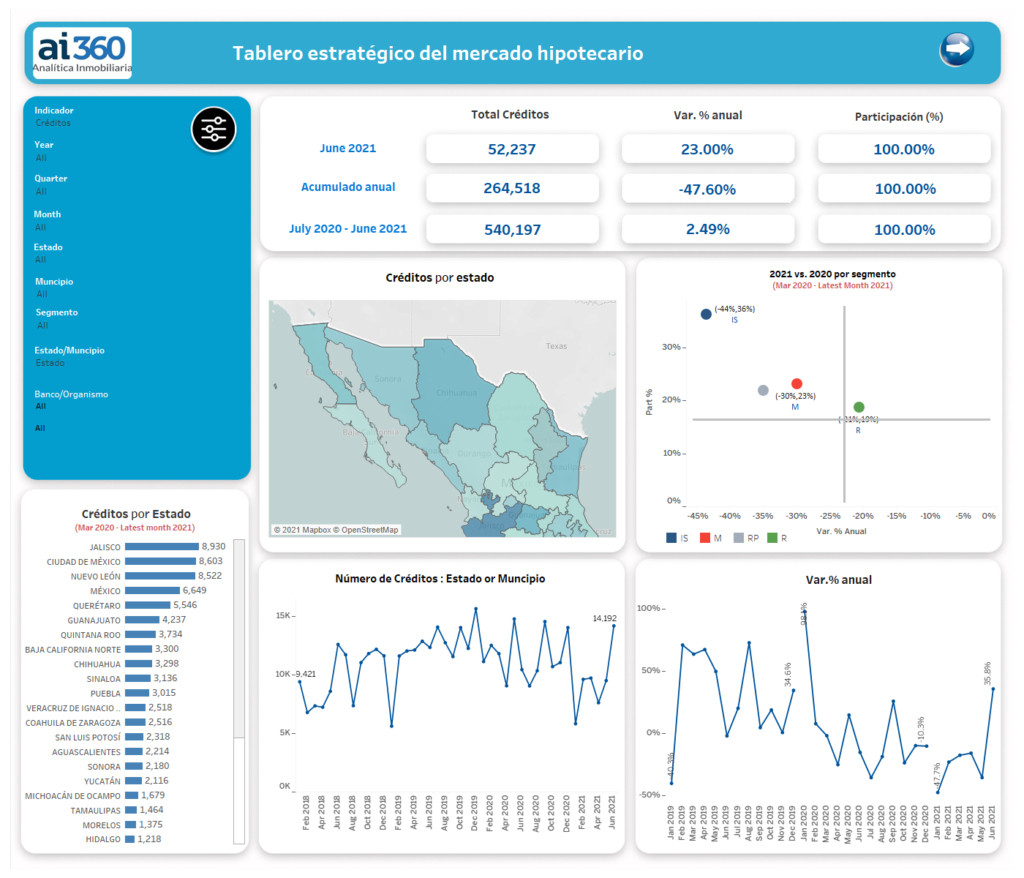
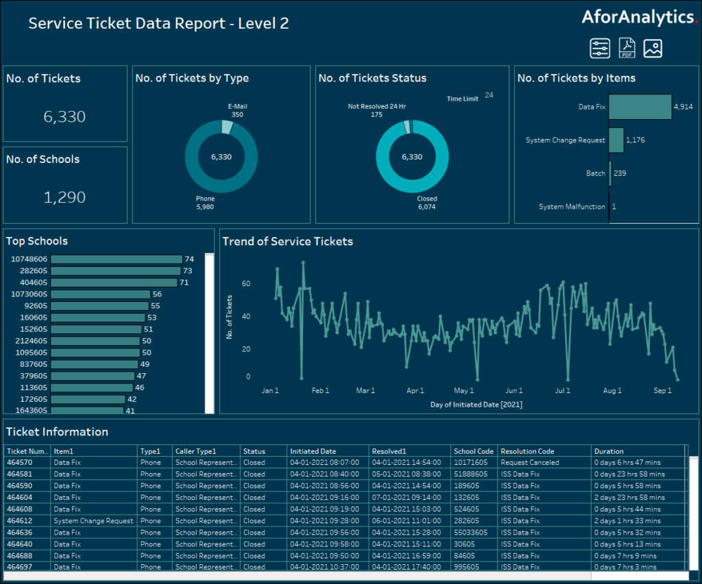
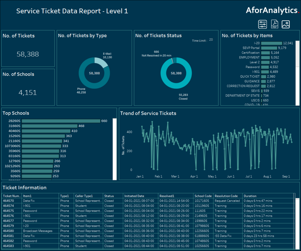
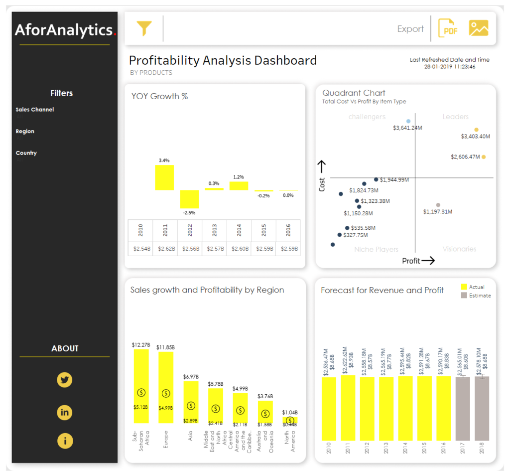
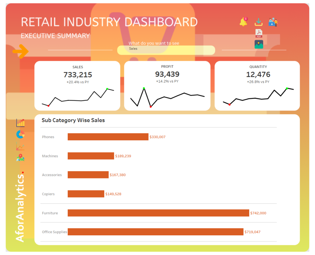
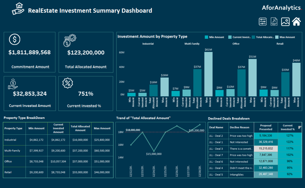
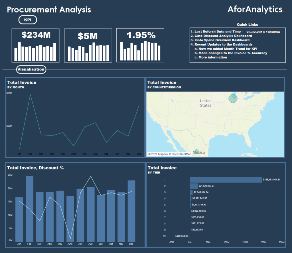
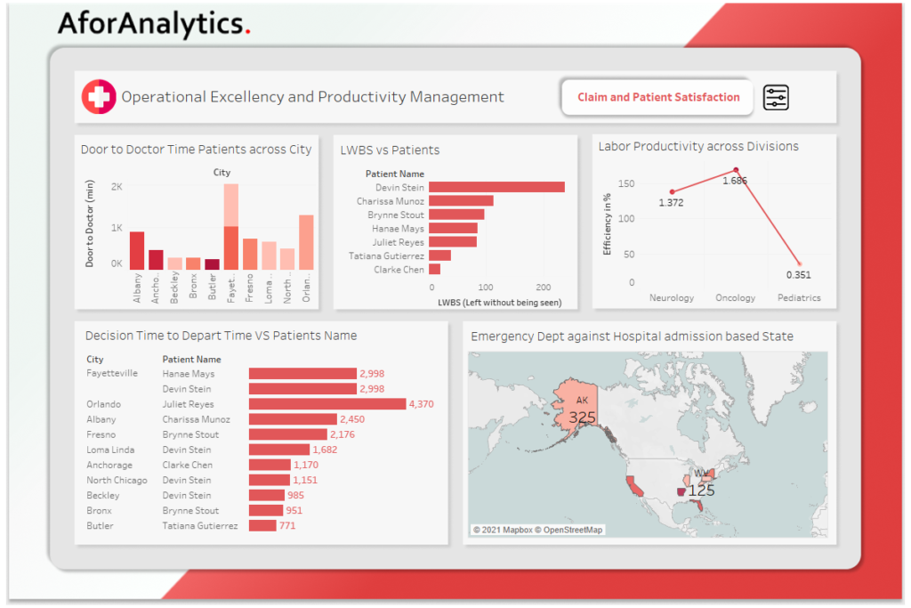
Customizing Power BI Dashboard Templates to Meet Your Needs
- Power BI offers a range of dashboard templates that can help you get started quickly.
- By customizing these templates to meet your specific needs, you can save time and focus on the more important aspects of your analysis.
- Whether you’re creating a dashboard for yourself or for a team, Power BI makes it easy to customize the layout, add new visualizations, and adjust the colors and fonts to match your branding.
Best Practices for Optimizing Your Power BI Experience
- To get the most out of Power BI, it’s important to follow best practices for data visualization and analysis.
- These include organizing your data sources and visualizations, using consistent color schemes and fonts, and testing your visualizations on different devices and screen sizes.
- By following these tips and tricks, you can create impactful visualizations that help you make better decisions and drive growth.
Conclusion:
Power BI is a valuable tool for businesses of all sizes that want to unlock the power of data visualization and analysis. With its wide range of features and customization options, Power BI can help you gain insights from your data and make better decisions. By following these tips and tricks, you can optimize your Power BI experience and take your business to the next level.